CASE STUDY: Mr. mayonnaise
Directed by Patrick Rahill

A Unique Approach
Mr. Mayonnaise was the rare film in which the director actually wanted the audience to notice the color grading, rather than just absorb it.
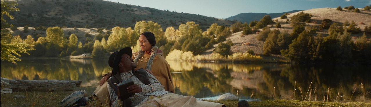
A highly stylized short film about a man’s childhood imaginary friend coming to life, we ended up employing several completely different looks for the film despite the entire film taking place in the protagonist’s bedroom. These looks were based on reference stills from other films and TV shows, which I sent to the director. While there was no attempt to create continuity between these distinct story beats, we did employ long crossfades to make the transitions less jarring. Nevertheless, the fact that the film switched between different looks was extremely obvious—as intended.
The film was shot on the Arri Alexa Classic in 2K Prores4444 in ArriLogC3, which offered enough latitude and information that I was able to push it into several extremely different directions.
The Looks
The first dark, warm, and rich look emphasized the suspense/horror tropes being used in the film for the initial sequence.


This transitioned into a more bright, neutral, and colorful look to help create a drastic tonal shift as Mr. Mayonnaise was revealed.
We then introduced a distinctly dry, clinical, digital, and visually unappealing look to convey the character’s efforts to push away his childhood imaginary friend. Creating something that’s ugly with a purpose is harder than it sounds, and it’s something I rarely get to do.


The dry, clinical look transitioned into a moody filmic look with lots of grain and cooler colors to emphasize the character’s emotional turmoil.
Lastly, we left audiences with a soft, pinkish look to emphasize the protagonist’s final realization and emotional resolution.

The Risk
This was a huge creative risk given that one of the goals of a colorist is generally not to draw too much attention to themselves. Audiences expect continuity, so employing dramatically different looks within the same scene would effectively break the fourth wall. We didn’t know for sure that it would work until the color grade was fully completed. The timing of the transitions and the length of the crossfades needed to be refined so that the visuals always followed the emotional arc of the characters.

THE PAYOFF:
A Uniquely Stylized Short Film
In the end, we both agreed that having multiple different looks for the same time and setting worked for the film.
The director walked away with a uniquely stylized color grade for a uniquely stylized short film. The movie has been screened at festivals across the country and gotten a great response.